カテゴリカル要因の相互作用の作図
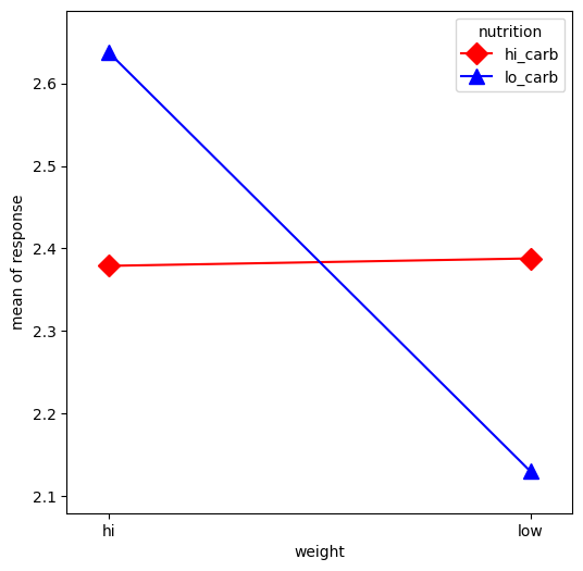
この例では、カテゴリカル要因間の相互作用を視覚化します。最初に、カテゴリカルデータを作成します。次に、interaction_plot関数を使用してプロットします。これにより、x要因のカテゴリが内部的に整数に再コードされます。
[1]:
%matplotlib inline

import numpy as np
import matplotlib.pyplot as plt
import pandas as pd
from statsmodels.graphics.factorplots import interaction_plot
[2]:
np.random.seed(12345)
weight = pd.Series(np.repeat(["low", "hi", "low", "hi"], 15), name="weight")
nutrition = pd.Series(np.repeat(["lo_carb", "hi_carb"], 30), name="nutrition")
days = np.log(np.random.randint(1, 30, size=60))
[3]:
fig, ax = plt.subplots(figsize=(6, 6))
fig = interaction_plot(
    x=weight,
    trace=nutrition,
    response=days,
    colors=["red", "blue"],
    markers=["D", "^"],
    ms=10,
    ax=ax,
)
最終更新日: 2024年10月3日